


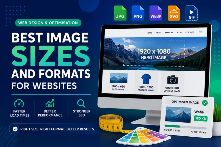
Best Image Sizes and Formats for Websites
Choosing the right image size, dimensions and format helps your website load faster, look more professional and perform better across desktop, tablet and mobile devices.
Website Image Optimisation
Correct dimensions + compression + modern formats = faster pages and better user experience.
Why Image Size Matters for Websites
Images are one of the most important parts of a modern website. They improve visual quality, explain services, support branding and create stronger first impressions. However, images can also be one of the biggest reasons why a website loads slowly.
Image Dimensions
Image dimensions describe the width and height of an image in pixels. For example, 1200 x 800 pixels means the image is 1200 pixels wide and 800 pixels tall.
- Controls display size
- Affects visual sharpness
- Should match the design area
- Helps avoid unnecessary file weight
File Size
File size is the weight of the image file, usually measured in KB or MB. Smaller files load faster, while very large files can slow down the entire page.
- Impacts page speed
- Affects mobile loading
- Can influence SEO performance
- Should be reduced with compression
The goal is simple: use enough pixels for good quality, but not so many that the website becomes slow. Bigger is not always better for web design.
Understanding Image Dimensions and Aspect Ratio
Aspect ratio is the relationship between the width and height of an image. If the aspect ratio is wrong, an image may look stretched, distorted or badly cropped.
| Image Use | Recommended Ratio | Example Size | Why It Works |
|---|---|---|---|
| Hero Banner | 16:9 or wide crop | 1920 x 1080 or 1920 x 800 | Works well for large headers and homepage sections. |
| Product Image | 1:1 | 1200 x 1200 | Creates clean and consistent e-commerce product grids. |
| Blog Featured Image | 1.91:1 | 1200 x 630 | Works well for blog cards and social media sharing previews. |
| Portfolio Image | 3:2 or 4:3 | 1500 x 1000 | Provides strong visual quality for creative and project-based work. |
| Avatar / Profile Image | 1:1 | 400 x 400 | Displays neatly in circular or square profile areas. |
Resolution and DPI for Website Images
For websites, pixel dimensions matter more than DPI. DPI is mainly important for print. On screens, an image is displayed based on its pixel size, not its printed DPI value.
For Web Use
Focus on pixel dimensions, file size, image format and compression. A correctly resized 1200px image is usually more useful than a huge high-DPI image.
For Print Use
DPI becomes important when preparing printed materials such as brochures, flyers and banners. Print files usually need higher resolution than web images.
Best Image Sizes for Common Website Areas
The best upload size depends on where the image appears. A hero image needs more width than a thumbnail, while a logo should usually be an SVG file rather than a large JPG or PNG.
| Image Type | Recommended Upload Size | Best Aspect Ratio | Target File Size | Best Format |
|---|---|---|---|---|
| Hero Banner | 1600–1920px wide | 16:9 or wide crop | 250–500 KB | WebP, AVIF, JPG |
| Blog Featured Image | 1200 x 630px | 1.91:1 | 150–300 KB | WebP, JPG |
| Blog Content Image | 900–1200px wide | Flexible | 100–250 KB | WebP, JPG |
| Product Image | 1200 x 1200px | 1:1 | 150–350 KB | WebP, JPG |
| Product Zoom Image | 1600 x 1600px | 1:1 | 250–500 KB | WebP, JPG |
| Gallery Image | 1200–1600px wide | 3:2 or 4:3 | 150–350 KB | WebP, JPG |
| Logo | Vector preferred | Flexible | Under 50 KB | SVG |
| Icon | Vector preferred | Flexible | Under 20 KB | SVG |
| Avatar | 400 x 400px | 1:1 | Under 100 KB | WebP, JPG, PNG |
| Social Sharing Image | 1200 x 630px | 1.91:1 | 150–300 KB | WebP, JPG |
Simple File Size Chart
This chart shows realistic file weight targets for common website images. The exact size depends on image detail, compression quality and format.
Best Image Sizes by Website Use Case
Different parts of a website need different image sizes. Matching the image to the design area helps maintain quality without slowing down the page.
Hero Images
Hero images are large banners usually placed at the top of a page. Use 1920 x 1080px for full widescreen banners or 1920 x 800px for wide website headers.
Blog Images
Blog featured images work well at 1200 x 630px. Images inside posts usually only need to be around 900–1200px wide.
Product Images
Product images should usually be square. A size of 1200 x 1200px creates clean grids, while 1600 x 1600px is better when zoom is needed.
Gallery Images
Gallery and portfolio images should usually be 1200–1600px wide. They need to look professional but should still be compressed.
Logos and Icons
Logos and icons should usually use SVG. SVG files stay sharp at all sizes and are often much smaller than pixel-based images.
Background Images
Background images should usually be 1600–1920px wide. They should be compressed because they can strongly affect loading speed.
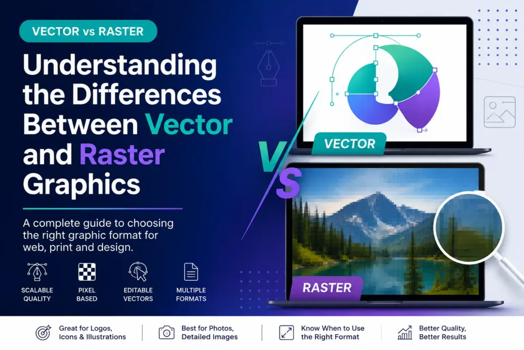
Choosing the Right Image Format
Different image formats are useful for different purposes. Choosing the right format helps reduce file size, improve quality and support better website performance.
| Format | Best For | Advantages | Disadvantages |
|---|---|---|---|
| JPG / JPEG | Photos and realistic images | Good compression, widely supported and usually smaller than PNG. | No transparency and quality can reduce when heavily compressed. |
| PNG | Transparent graphics and sharp UI images | Supports transparency and preserves quality well. | Usually creates larger file sizes than JPG or WebP. |
| WebP | Most website images | Strong compression, good quality and supports transparency. | May require fallback handling in some older systems. |
| AVIF | High-compression modern images | Very small file sizes with strong visual quality. | Can be slower to export and may not fit every workflow. |
| SVG | Logos, icons and simple illustrations | Scalable, sharp and often very lightweight. | Not suitable for photos or complex realistic images. |
| GIF | Very simple animations | Easy animation support and widely recognised. | Limited colours and inefficient for large animations. |
Best Format Recommendations
For most modern websites, the best format depends on whether the image is a photograph, logo, icon, transparent graphic or animation.
Use WebP for Most Website Images
WebP gives strong quality with smaller file sizes, making it a good default choice for many website photos and graphics.
Use SVG for Logos and Icons
SVG files stay sharp at every size, making them ideal for branding, icons, interface graphics and simple illustrations.
Use JPG for Photos When Needed
JPG is still useful for photographs, especially when WebP or AVIF is not available in your workflow.
Use PNG Only When Necessary
PNG is best when transparency or lossless quality is needed, but it should not be used for every normal photo because file sizes can be large.
Examples of Good and Bad Image Uploads
These examples show how resizing and changing format can make a website faster without destroying visual quality.
Homepage Hero Banner
Bad: 5000 x 3000px JPG, 4.5 MB.
Better: 1920 x 900px WebP, around 350 KB.
Blog Post Image
Bad: 3000 x 2000px PNG, 3 MB.
Better: 1200 x 800px WebP, around 180 KB.
Product Image
Bad: Mixed shapes and inconsistent image sizes.
Better: 1200 x 1200px square WebP images.
Logo
Bad: Large JPG logo with white background.
Better: Clean SVG logo that stays sharp on all devices.
Why One Image Size Is Not Always Enough
Modern websites are viewed on phones, tablets, laptops and large monitors. Responsive images allow the browser to choose a suitable image size depending on the device and screen resolution.
Desktop Users
A desktop screen may need a larger image, such as 1600px wide, especially for banners or full-width sections.
Mobile Users
A mobile user may only need a 600px wide image. Loading the full desktop version can waste data and slow the page down.
WordPress Image Sizes
WordPress often creates multiple image sizes automatically, but uploaded images still need to be prepared and optimised properly.
Image Width and Performance Impact
Large image widths can be useful, but they should match the purpose. Very large images are often unnecessary for normal business websites.
Image Compression Best Practices
Compression reduces image file size while keeping acceptable visual quality. It is one of the most important steps in website image optimisation.
Useful Compression Tools
Tools such as TinyPNG, Squoosh, ShortPixel, Imagify, ImageOptim, Photoshop export settings and Canva export options can help reduce image weight.
- Resize before upload
- Compress after resizing
- Use WebP where possible
- Check quality after compression
Why Compression Matters
Compressed images load faster, reduce bandwidth usage and improve the browsing experience, especially for mobile visitors.
- Faster page loading
- Better mobile performance
- Lower server load
- Improved user experience
Image SEO Best Practices
Images are not only visual elements. They also support SEO and accessibility when they are named, described and optimised correctly.
Use Descriptive File Names
Instead of IMG_4839.jpg, use a descriptive name such as website-image-size-guide.webp. This helps organisation and gives search engines more context.
Add Useful Alt Text
Alt text helps screen readers and search engines understand what an image shows. It should describe the image naturally.
Use Captions When Helpful
Captions are useful when an image explains something important, such as a chart, comparison, example or visual guide.
Avoid Keyword Stuffing
Do not force keywords into every image. File names and alt text should be clear, useful and relevant.
Recommended Image Upload Workflow
Before uploading images to a website, follow a simple workflow to keep the site fast, professional and easy to manage.
Choose the Use Case
Decide whether the image is for a hero section, blog post, product, gallery, logo or social sharing preview.
Set the Correct Size
Resize the image to suitable pixel dimensions instead of uploading the original oversized file.
Export the Right Format
Use WebP for most images, SVG for logos and icons, JPG for photos when needed, and PNG only for special cases.
Compress the Image
Reduce file size with compression tools while checking that the final image still looks clean.
Add SEO Details
Rename the file properly, upload it to the website and add useful alt text for accessibility and SEO.
Test on Devices
Check the page on desktop, tablet and mobile to make sure the image is not stretched, blurry or slow.
Quick Website Image Checklist
Use this checklist before publishing a page or article with images.
Image Quality Checks
- The image is not larger than needed
- The file size is reasonable
- The format is correct
- The image is compressed
- The aspect ratio fits the layout
Website Performance Checks
- The image is not blurry or stretched
- The image has descriptive alt text
- The page looks good on mobile
- Large images do not slow down the page
- Logos and icons use SVG where possible
Final Recommended Image Sizes
For most business websites, these image sizes are a safe starting point. They provide a good balance between quality and performance.
| Website Area | Recommended Size | Recommended Format |
|---|---|---|
| Hero Image | 1920 x 900px or 1920 x 1080px | WebP, AVIF, JPG |
| Blog Featured Image | 1200 x 630px | WebP, JPG |
| Blog Content Image | 900–1200px wide | WebP, JPG |
| Product Image | 1200 x 1200px | WebP, JPG |
| Product Zoom Image | 1600 x 1600px | WebP, JPG |
| Gallery Image | 1200–1600px wide | WebP, JPG |
| Logo | Vector preferred | SVG |
| Icon | Vector preferred | SVG |
| Avatar | 400 x 400px | WebP, JPG, PNG |
| Social Sharing Image | 1200 x 630px | WebP, JPG |
Good Image Optimisation Improves Speed, SEO and Design
Choosing the best image size for a website is about balance. Images need to look professional, but they should not slow down the website. The best approach is to use the correct dimensions, choose the right format, compress the file and make sure the image works across different devices.
Faster Website Performance
Proper image sizes and compression help pages load faster, especially on mobile devices and slower connections.
Better User Experience and SEO
Optimised images improve usability, reduce frustration and support stronger search performance.
Image Optimisation, Web Design and SEO Support
PRO.COMP Solutions helps businesses create websites that look professional and perform efficiently. From image optimisation and responsive web design to SEO, branding and digital strategy, we prepare websites that are fast, user-friendly and ready for modern online competition.
Fast and Professional Websites
We optimise website structure, images and design elements to improve speed, presentation and user experience.
SEO and Digital Growth
We help businesses improve visibility, image SEO, content structure and overall digital performance.
Need Help Optimising Your Website Images?
PRO.COMP Solutions can help you create a faster, cleaner and more professional website with properly optimised images, responsive layouts and SEO-focused design.


